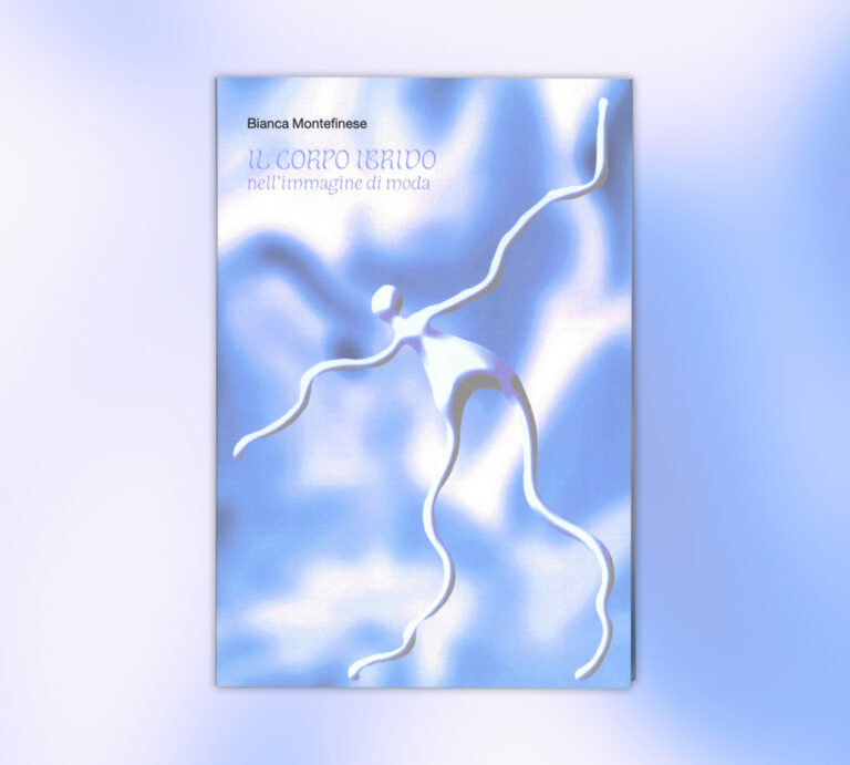
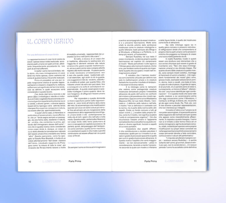
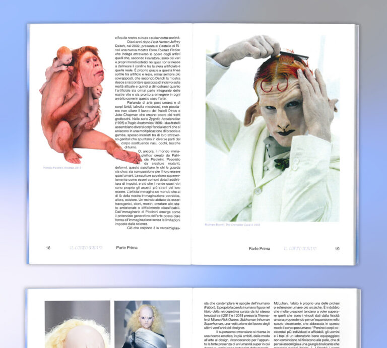
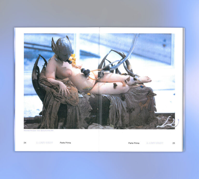
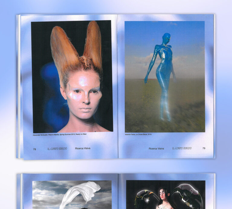
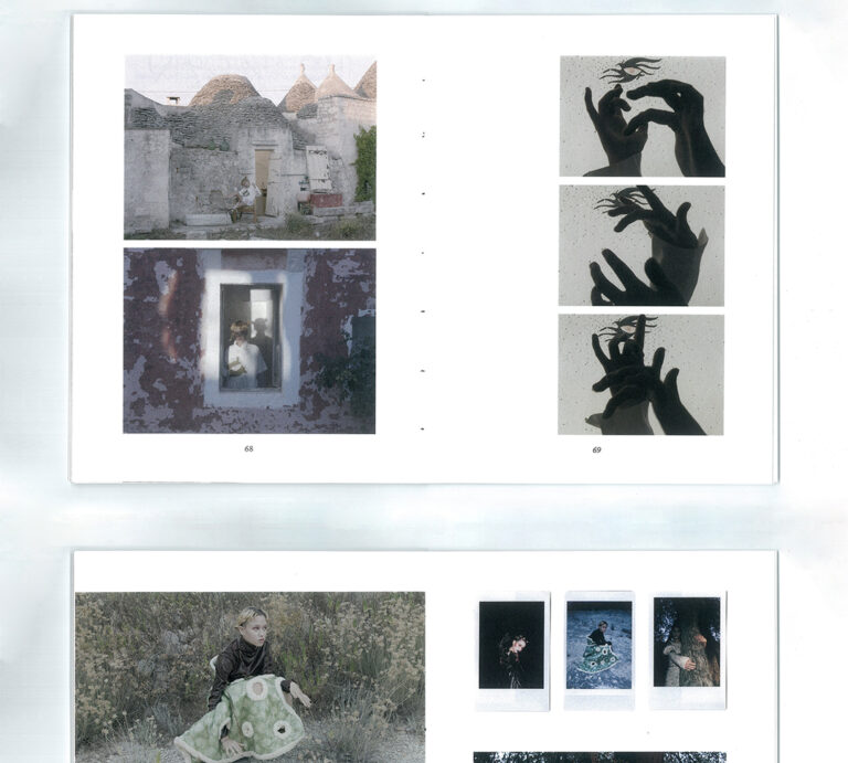
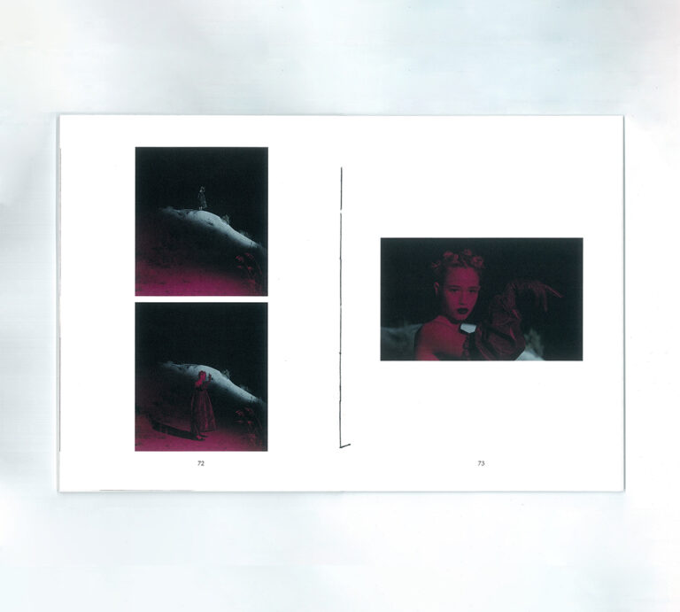
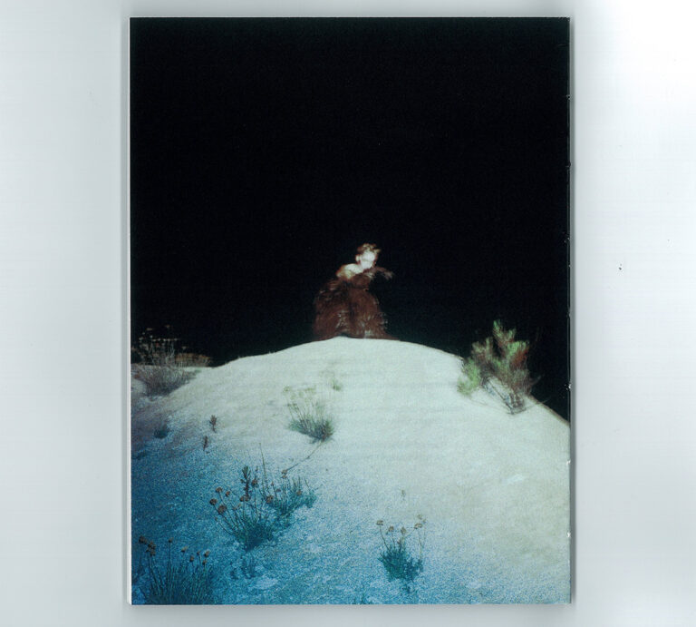
“Il Corpo Ibrido nell’immagine di moda” is the graduation project of Bianca Montefinese in Visual Arts and Fashion. The research investigates the presence of a posthuman dimension in fashion. (2023)
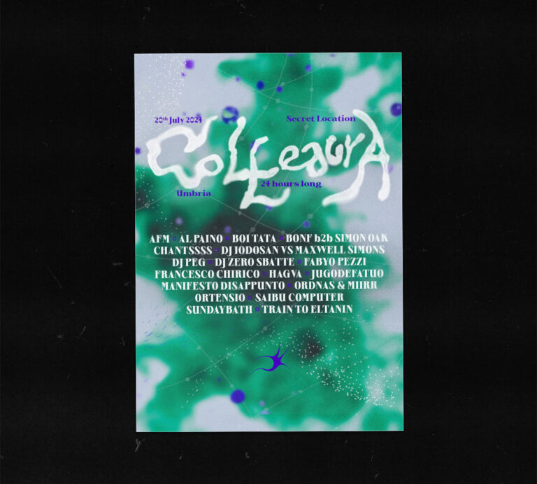
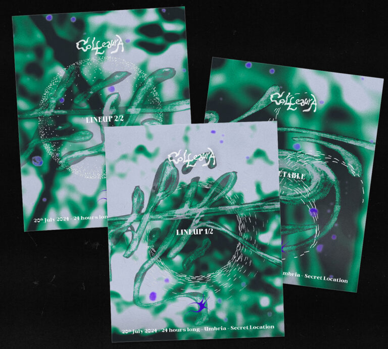
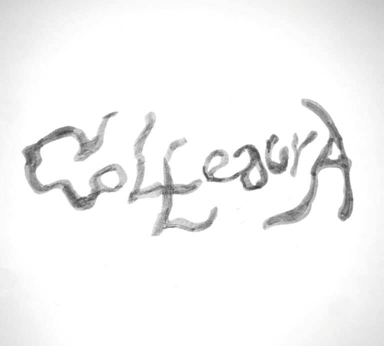
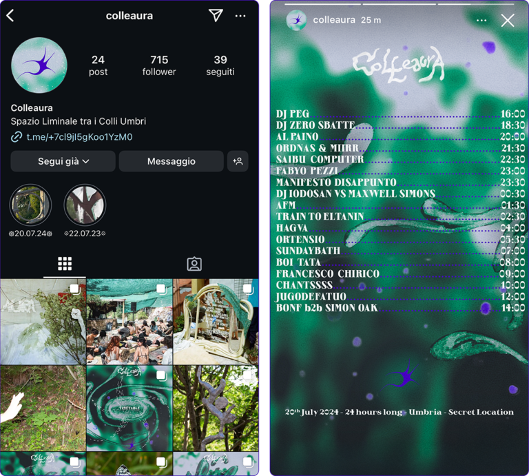
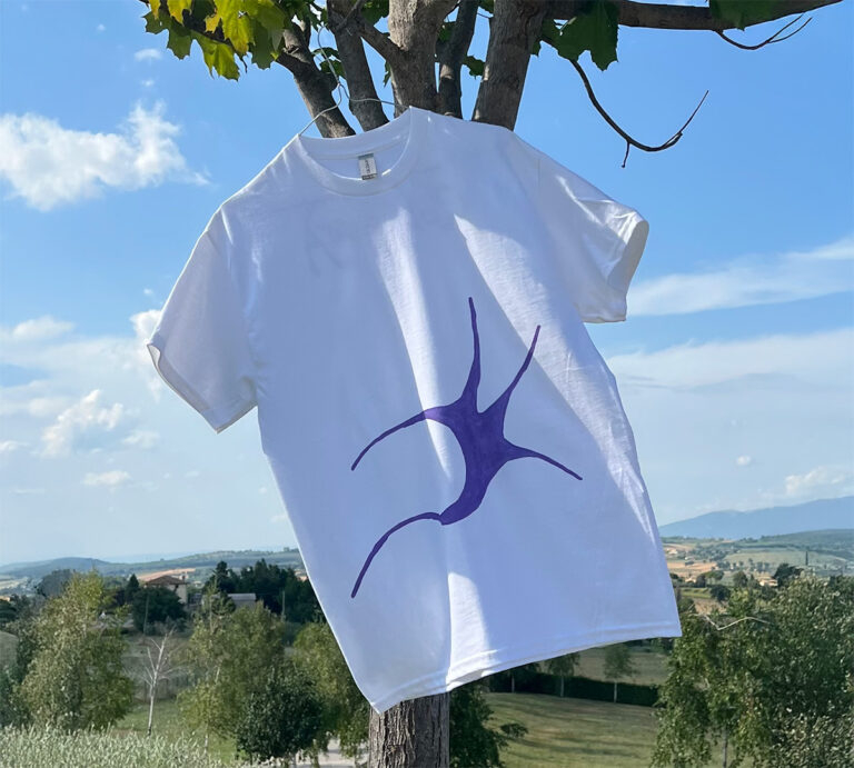
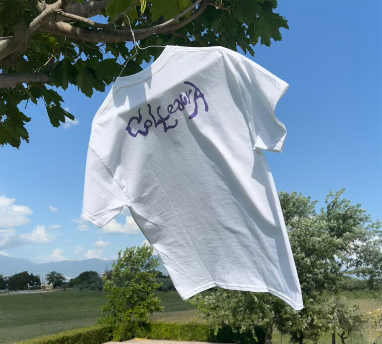
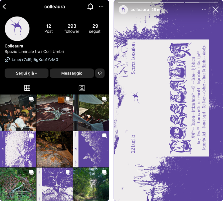
Colleaura 2024
Design of the lettering and flyer for Colleaura second edition, creation of additional graphics and photo selection for Instagram account management, t-shirt design. (2024)
La Corte dei Miracoli
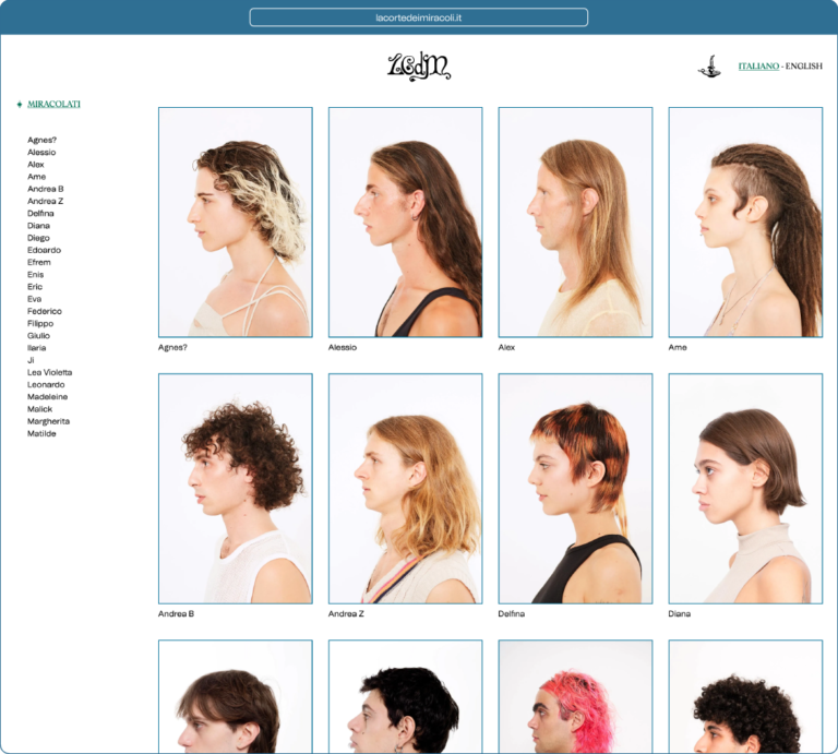
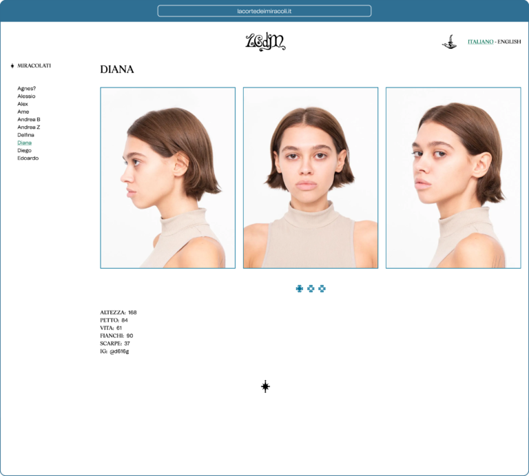
La Corte dei Miracoli is a street casting agency based in Rome, for which I created a website that can be visited at the link https://lacortedeimiracoli.it/ (2021)
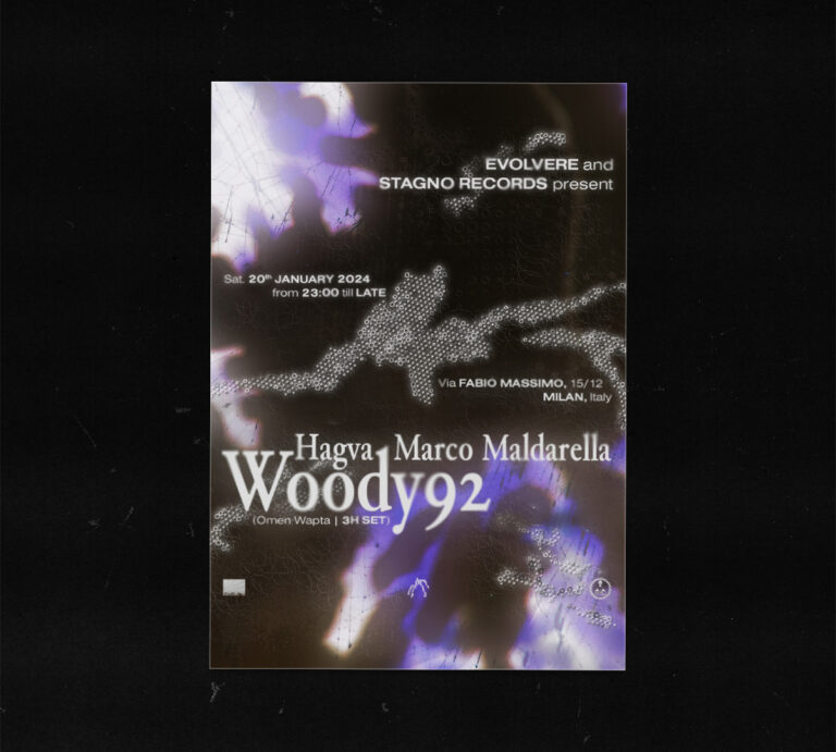
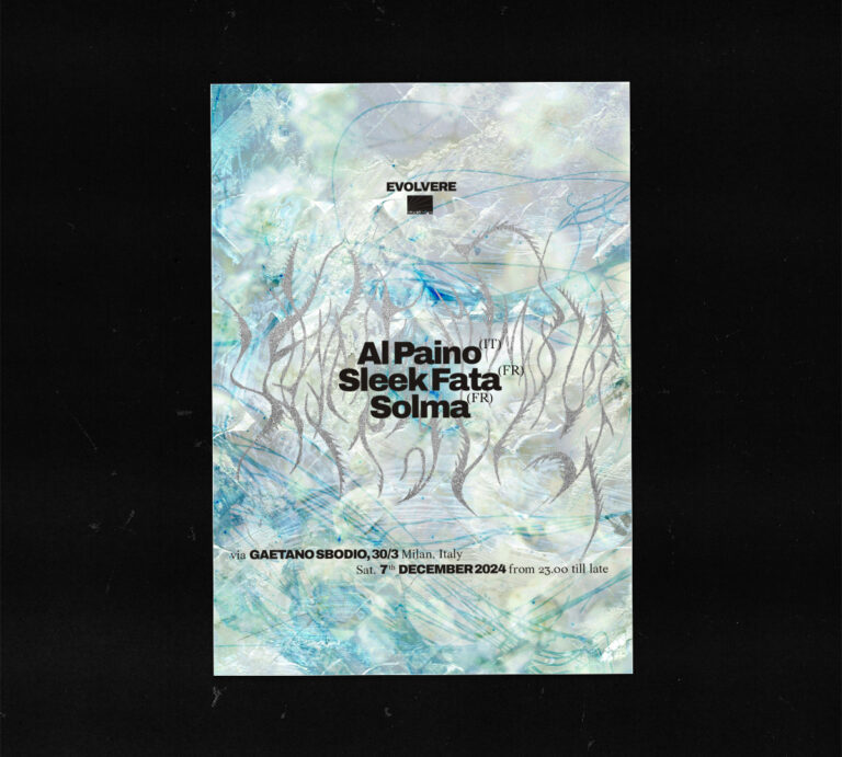
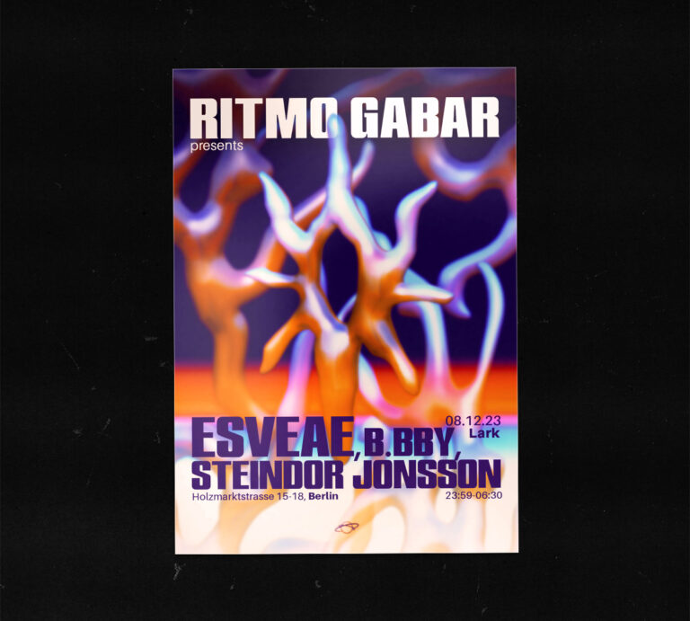
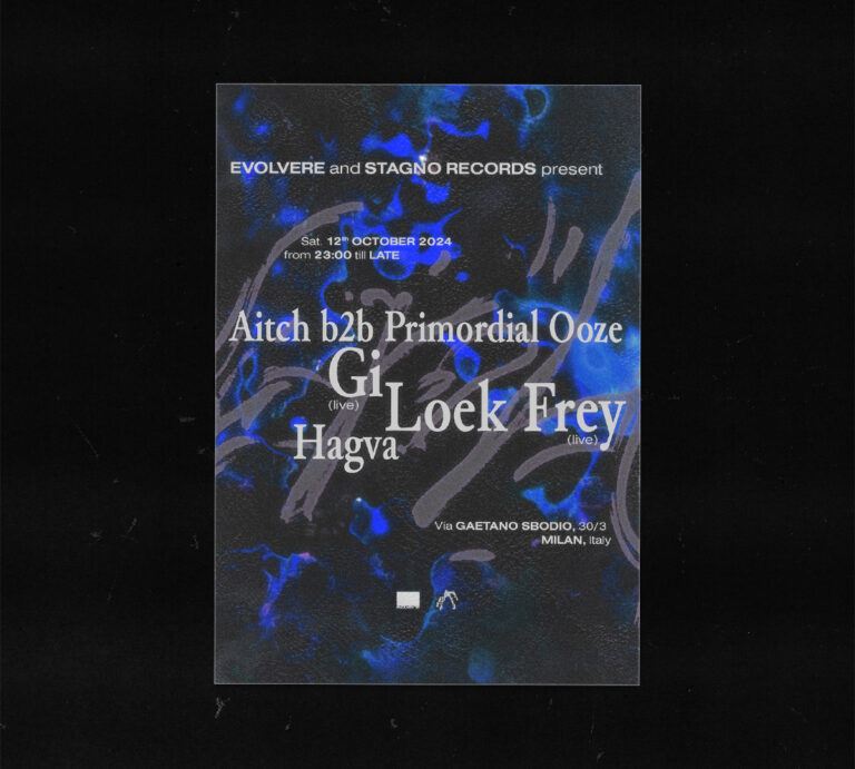
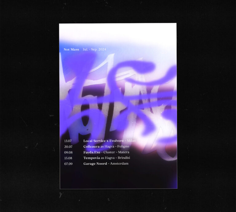
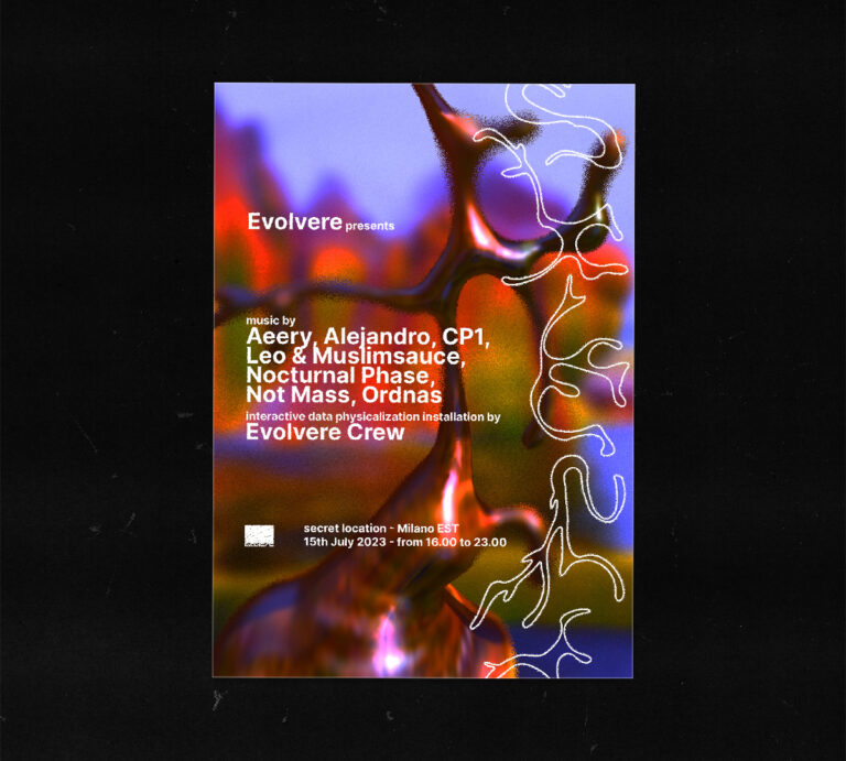
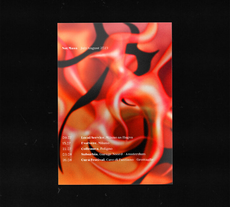
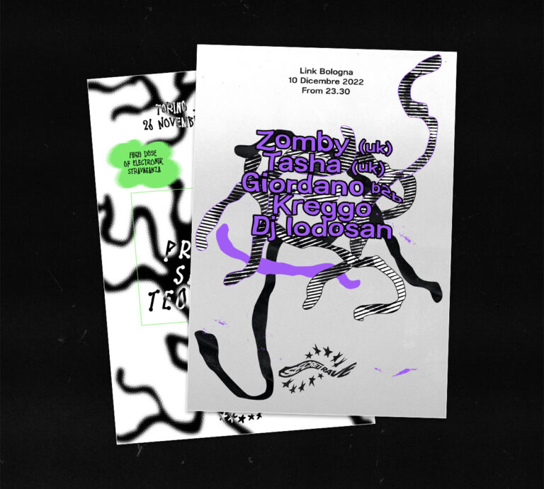
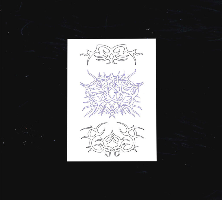
Events flyers
Some flyers made lately promoting different electronic music events featuring Milan and Italy based DJs but also some international guests. (2022 – ongoing)
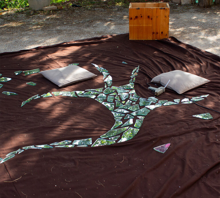
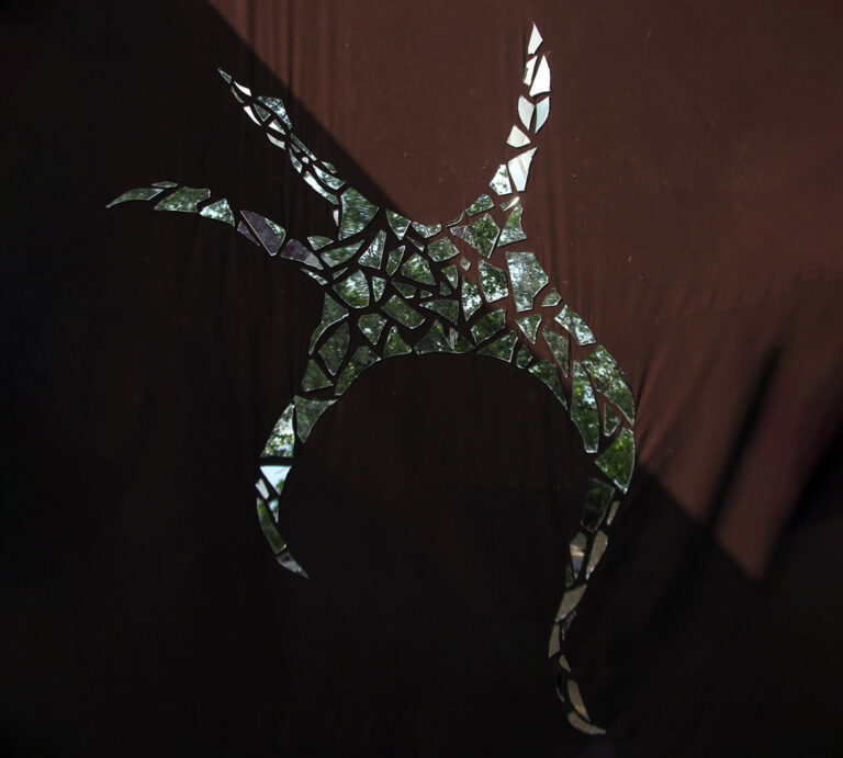
Colleaura 2023
Colleaura is a music event located in Umbria for which I created the logo and planned the contents for the Instagram profile. The logo has been recreated with pieces of broken glass. (2023)
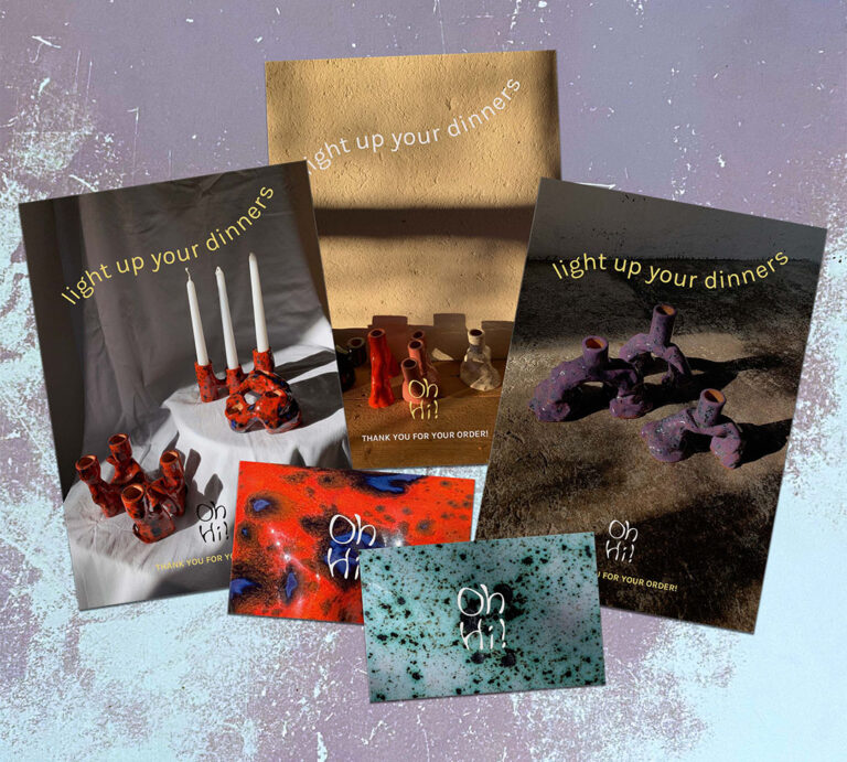
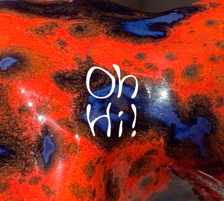
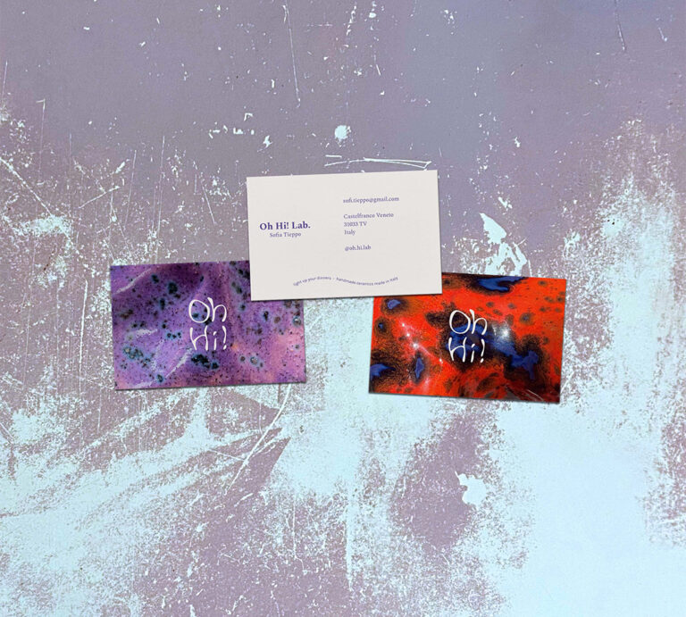
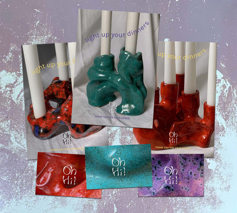
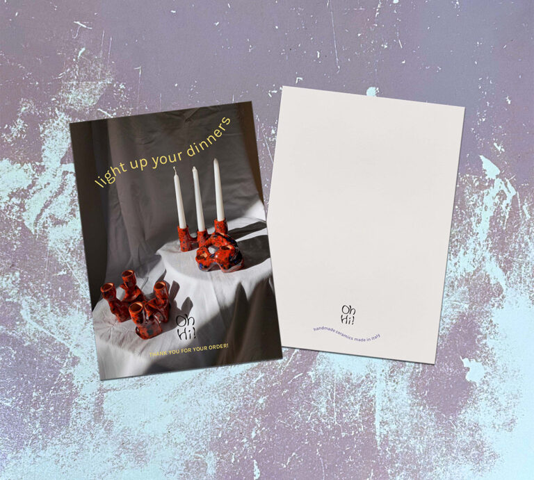
OhHi!
OhHi! is a small local pottery business. I designed the their brand identity, choosing fonts and colors and designing a logo, flyers to be included in orders and business cards. (2022)
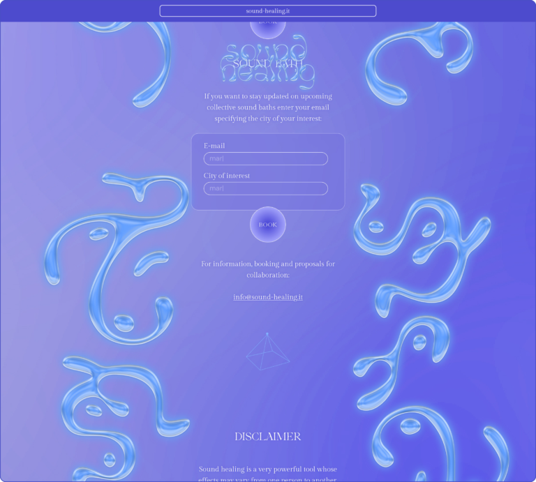
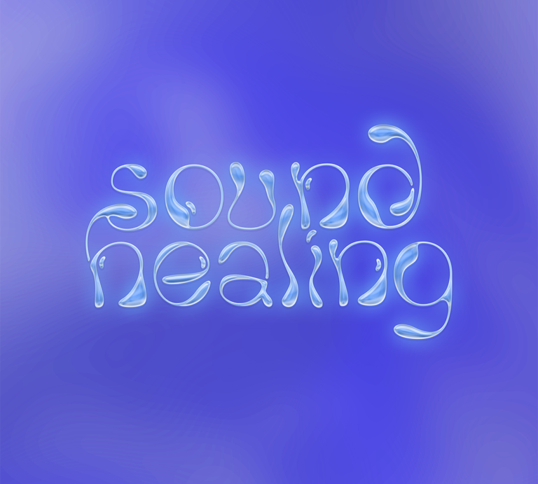
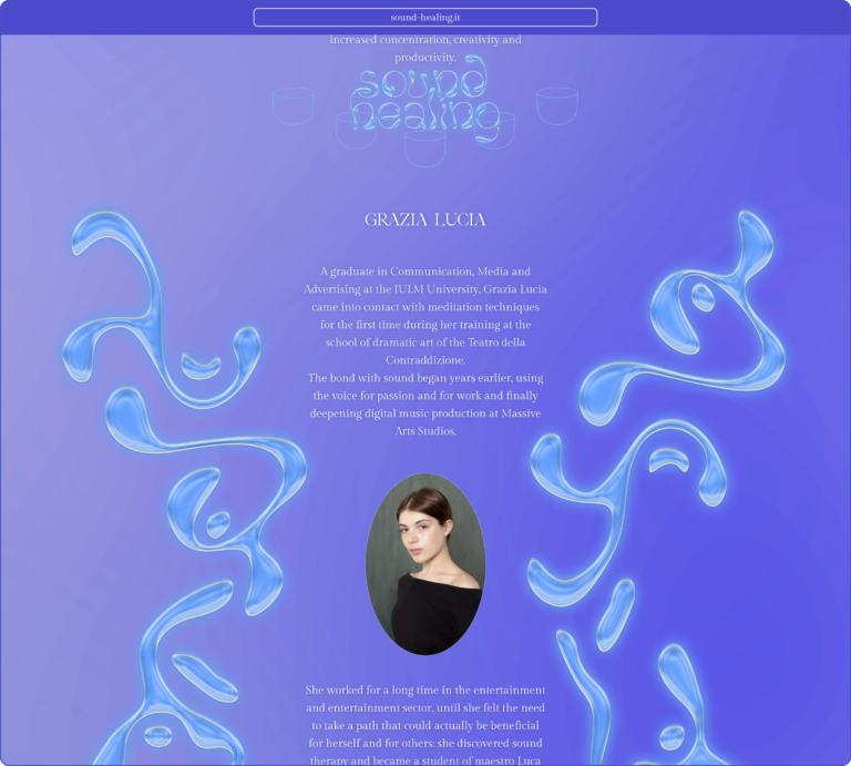
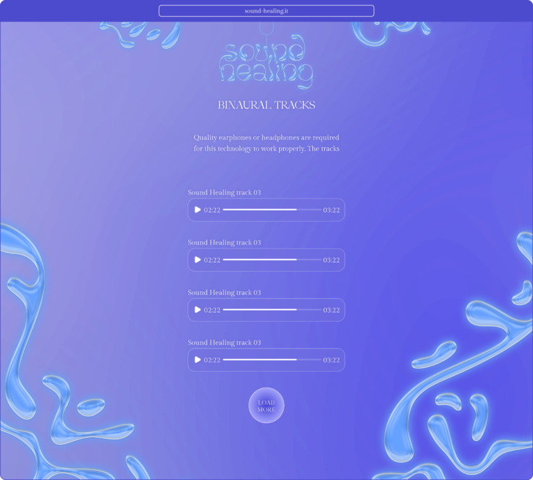
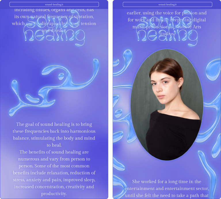
Sound Healing
Design of the lettering and the website for Grazia Lucia, a sound healer that explains this discipline, has her sessions booked and share her tracks through this website, available at the link https://www.sound-healing.it/ (2023)
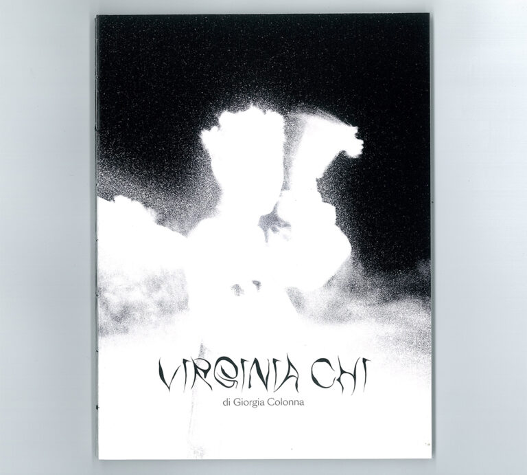
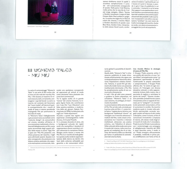
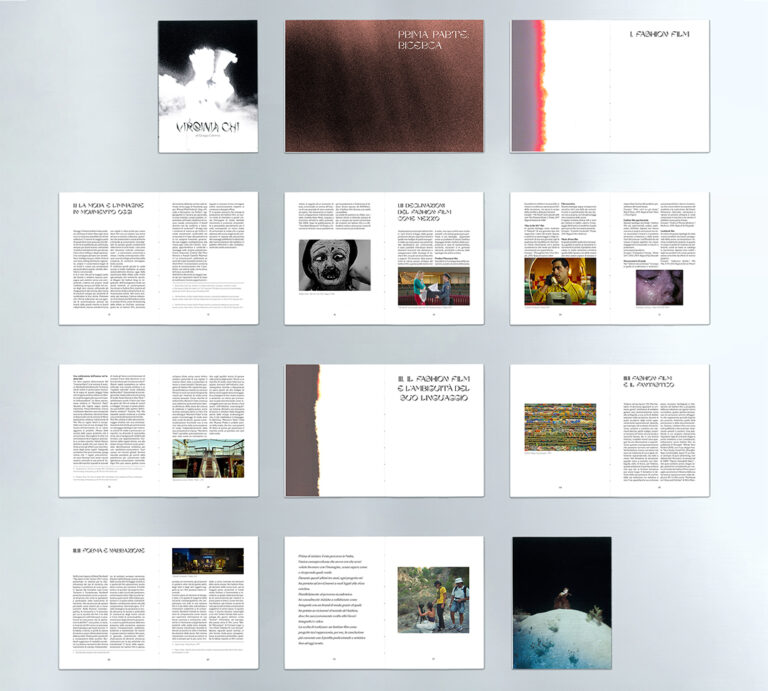
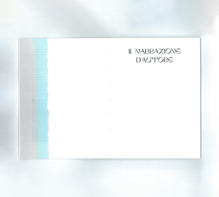
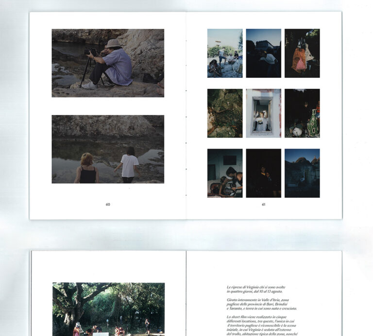
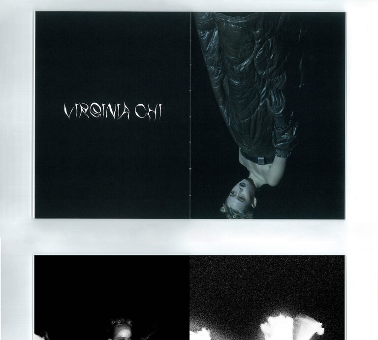
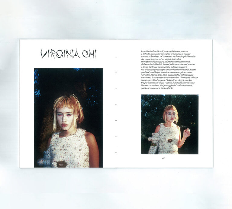
Virginia Chi
“Virginia Chi” is Giorgia Colonna’s graduation project, a short film with an ethereal and dreamlike atmosphere about the fashion film, for which I designed the editorial project. (2020)
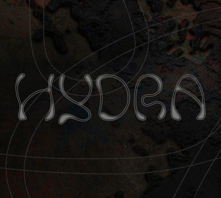
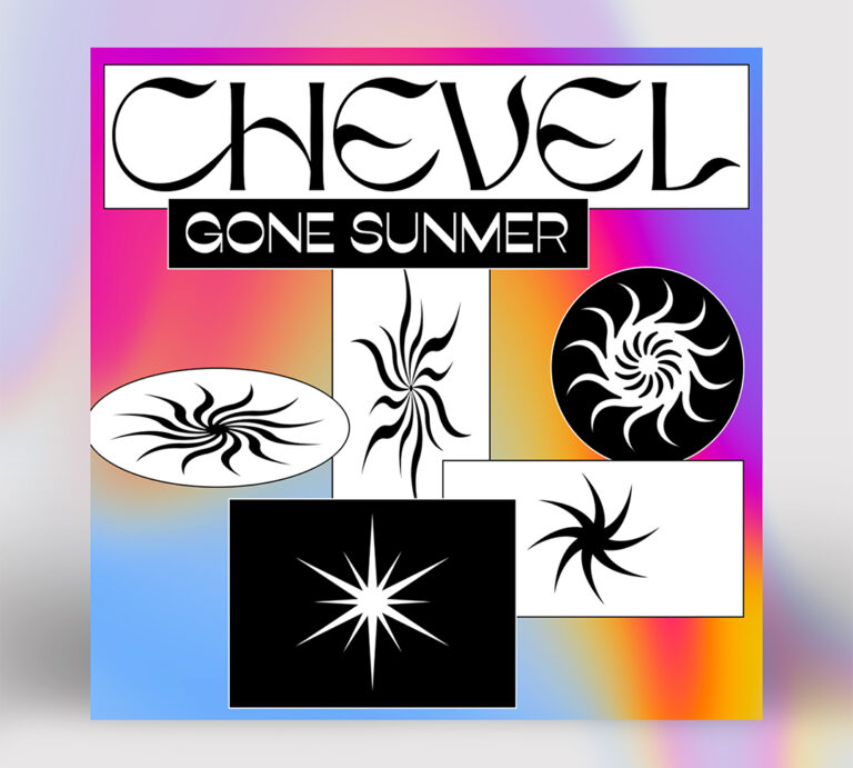
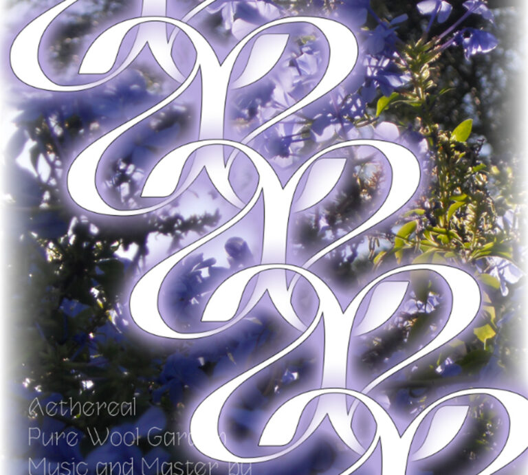
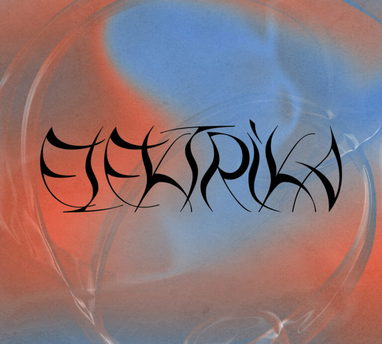
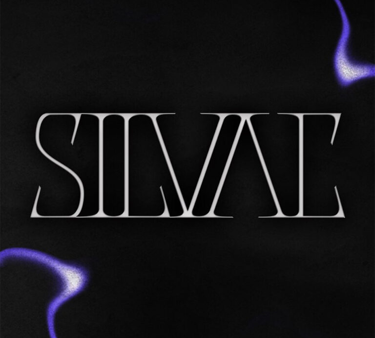
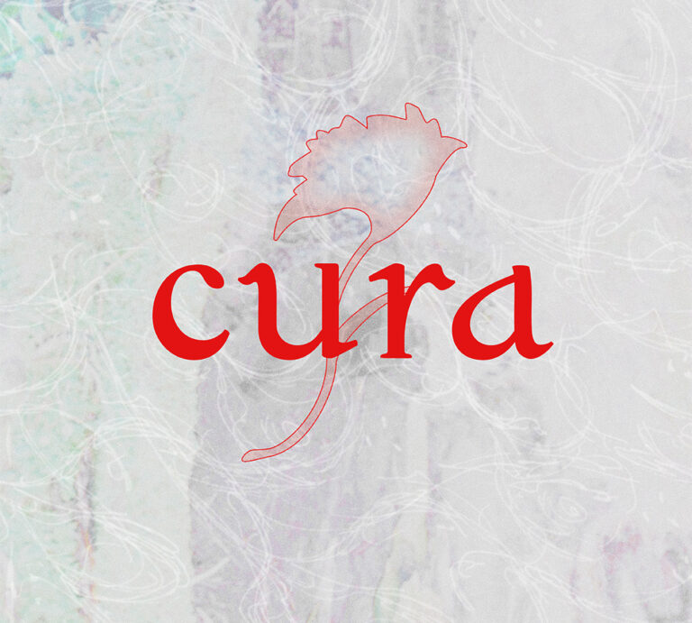
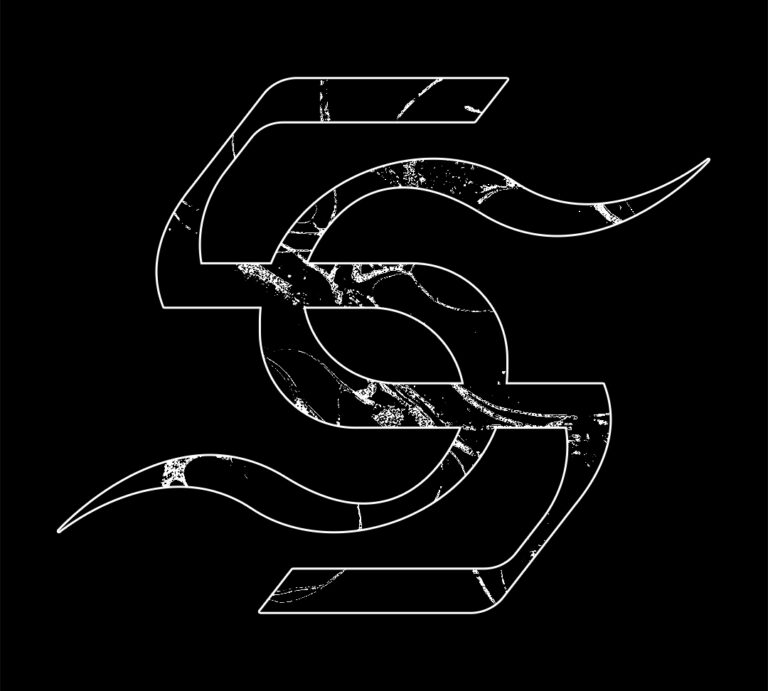
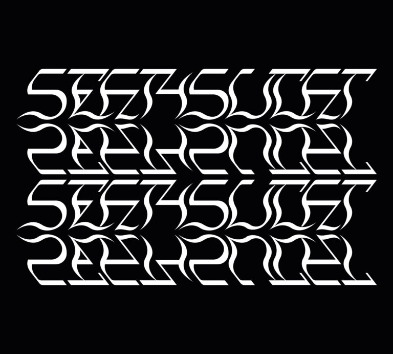
Lettering
Here are some of the lettering I’ve developed over the years, for different projects and clients, but which somehow denote my interest in creating original letters and logos, which sometimes play with readability. (2019 – ongoing)
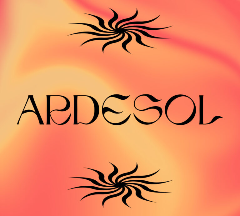
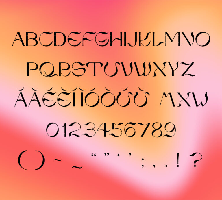
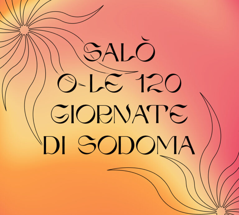
Ardesol
Ardesol is a typeface that evokes the symbology and figures of the sun. It is an all caps typeface, it has basic punctuation and accented characters. To purchase it, send an email to federica.aulenta@gmail.com (2021)
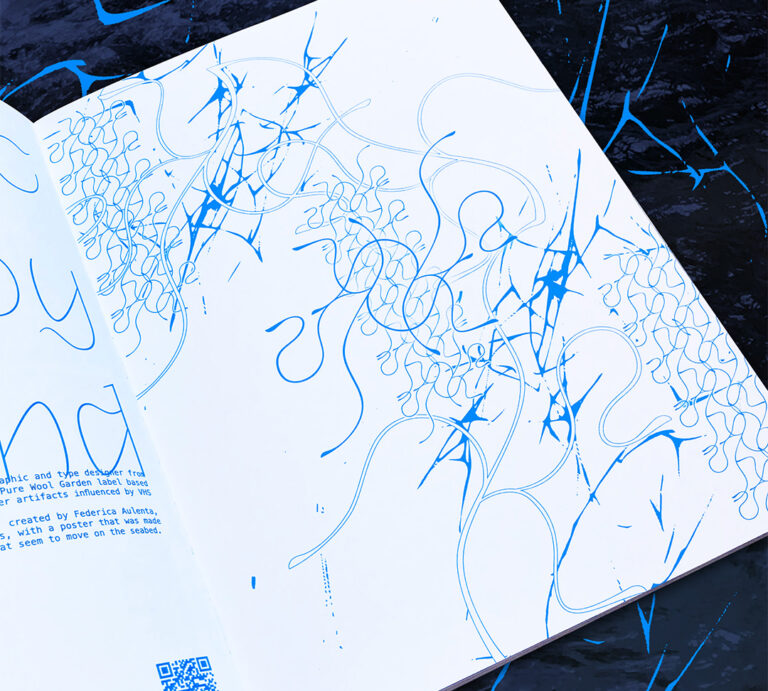
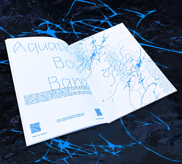
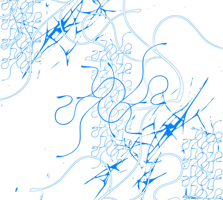
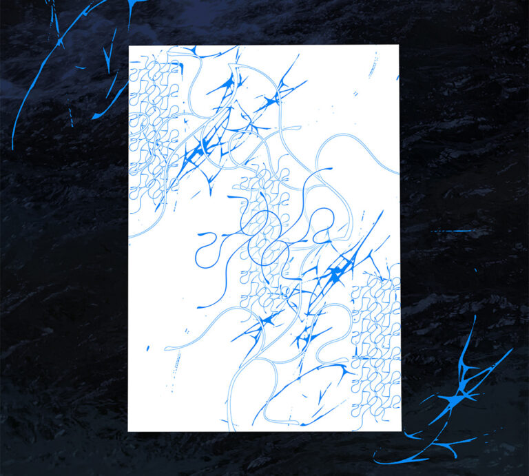
Aquatic Boy Band
Poster created for the fluid issue of U_UZ3R magazine, using the logo and graphics of Aquatic Boy Band, a musical project by Panacef Mishima. (2021)
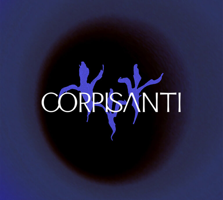
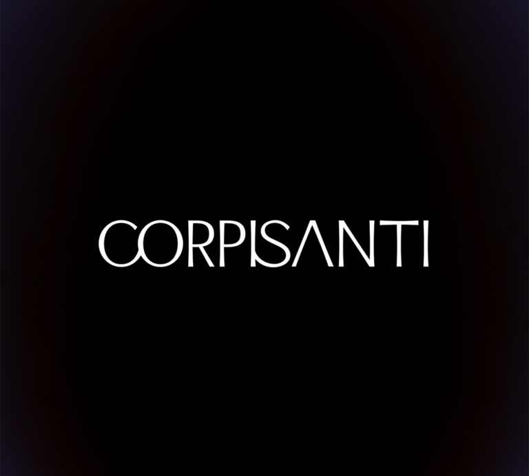
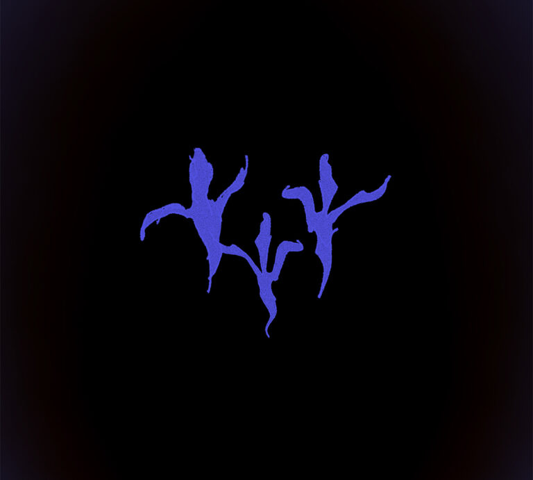
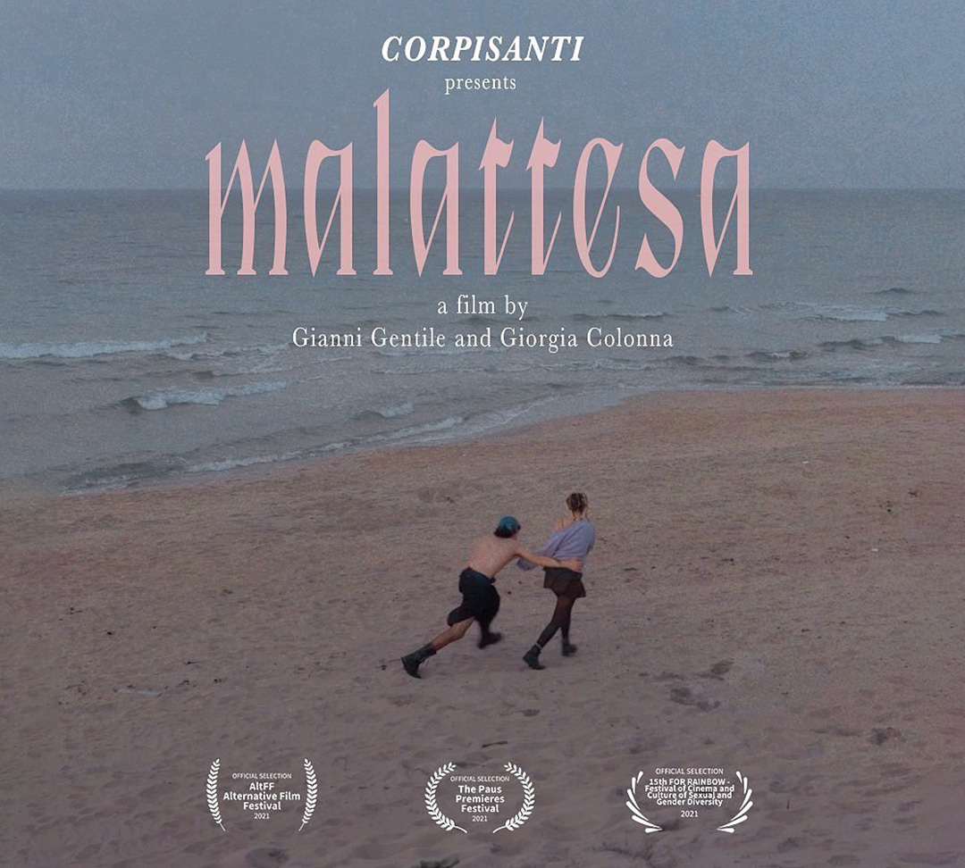
Corpisanti
Corpisanti is a collective of art directors and video makers for whom I created a lettering and a logo that recalled the idea of will-o’-the-wisp, from which the name was inspired.(2021)
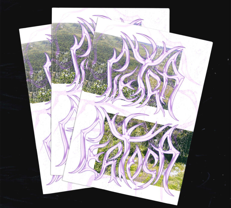
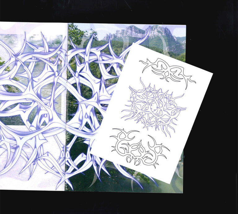
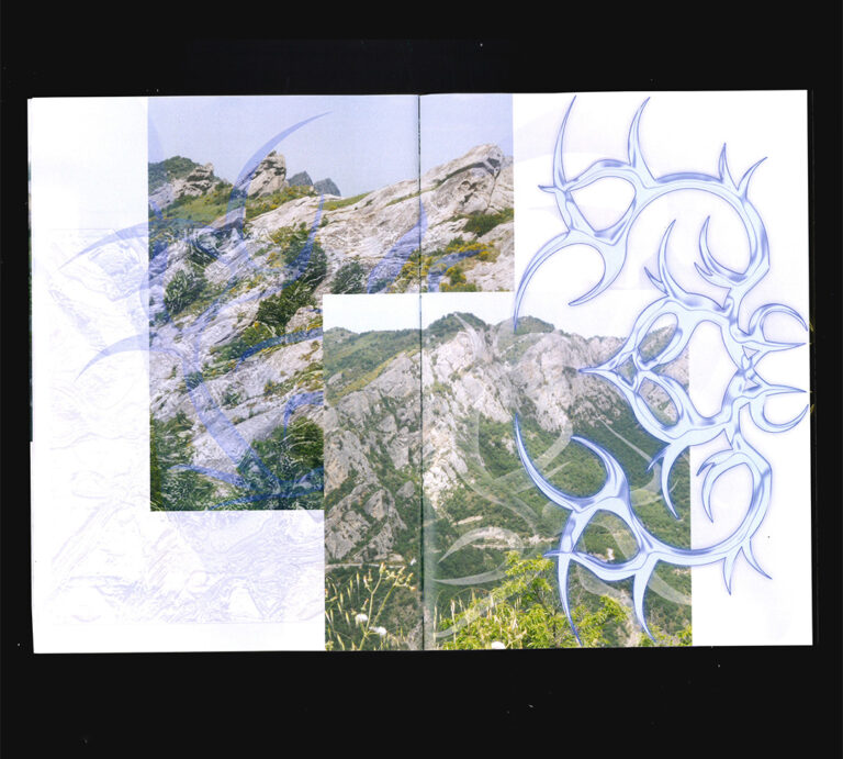
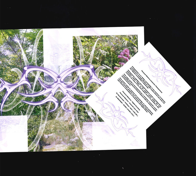
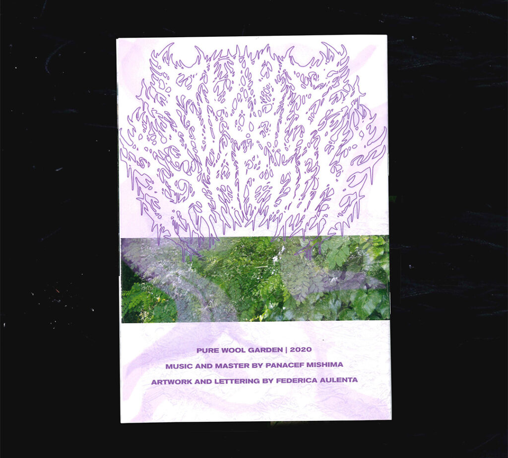
Pietrapertosa
Pietrapertosa is a small town in Basilicata; Panacef Mishima has created 4 tracks of PC music which, together with this “guide”, narrate this territory through graphics and the exploration of unknown symbols. (2020)
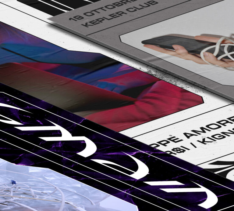
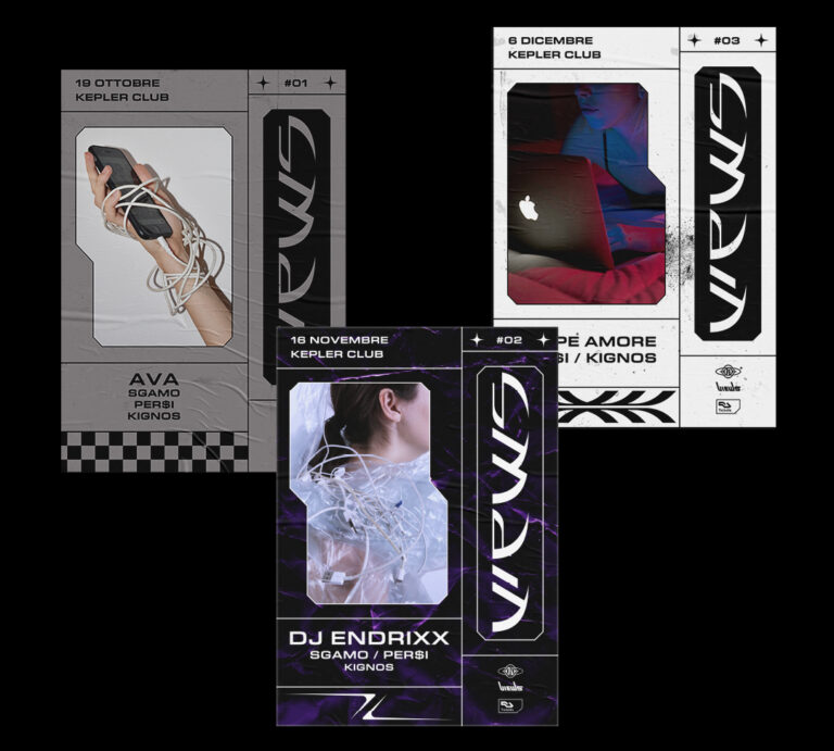
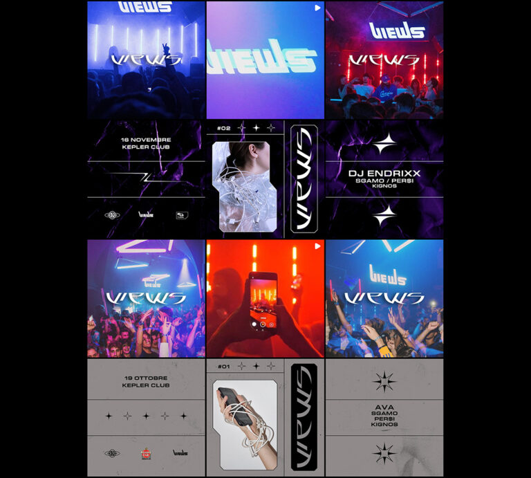
Views
Views was the first trap event in Bari, hosted by the Kepler Club. For each date I created a poster, a story and a post for Instagram, with photographs about our relationship with social networks and digital devices. (2019)
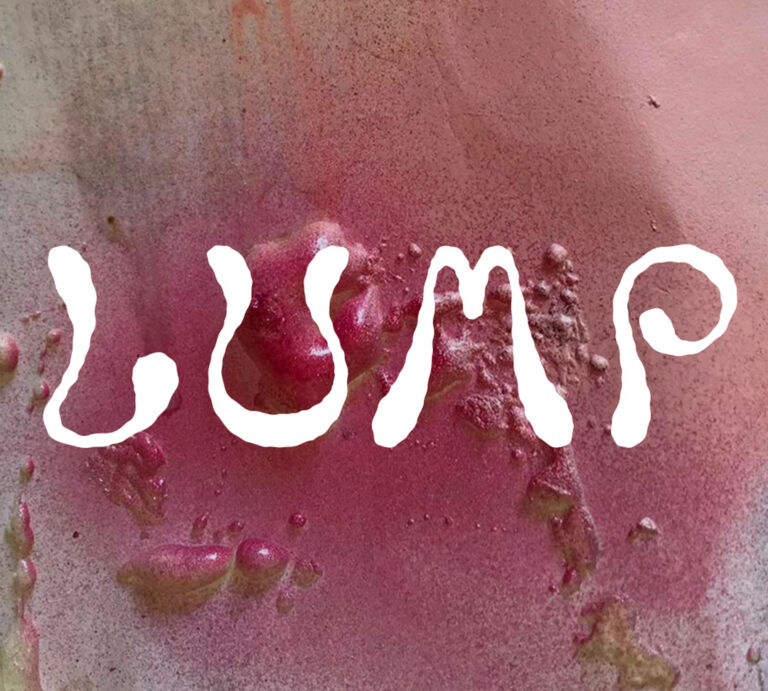
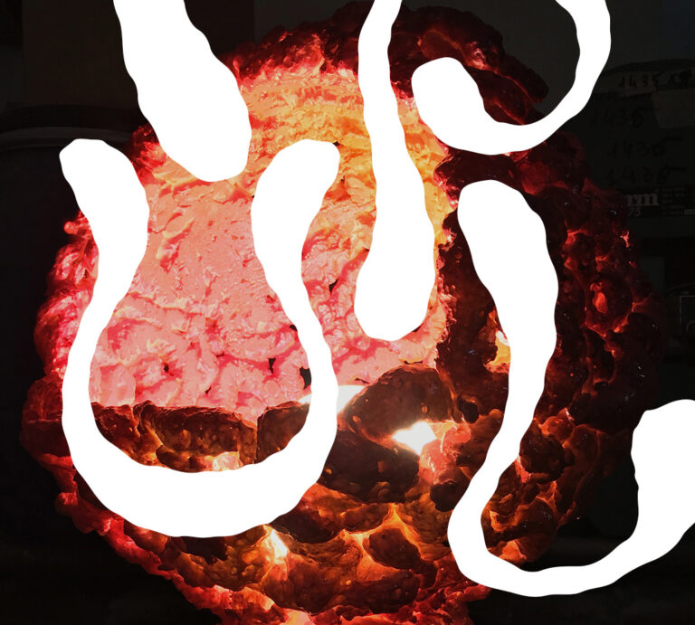
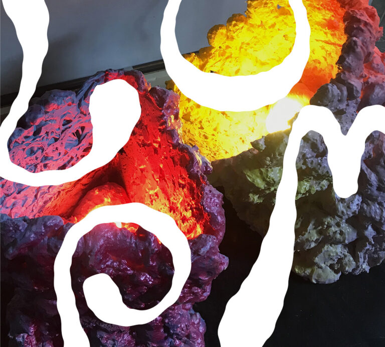
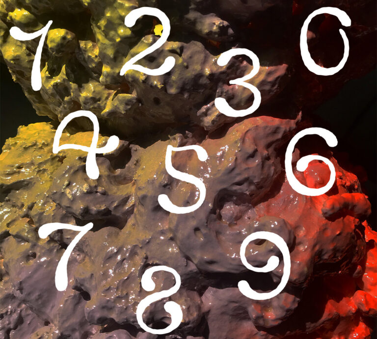
Lump
“Lump” is a series of lamps made with foam and resin, with lumpy profiles and bright colours. I created a logotype and numbers with rough and imperfect shapes that recall the bumpy shapes of the lamps. (2021)
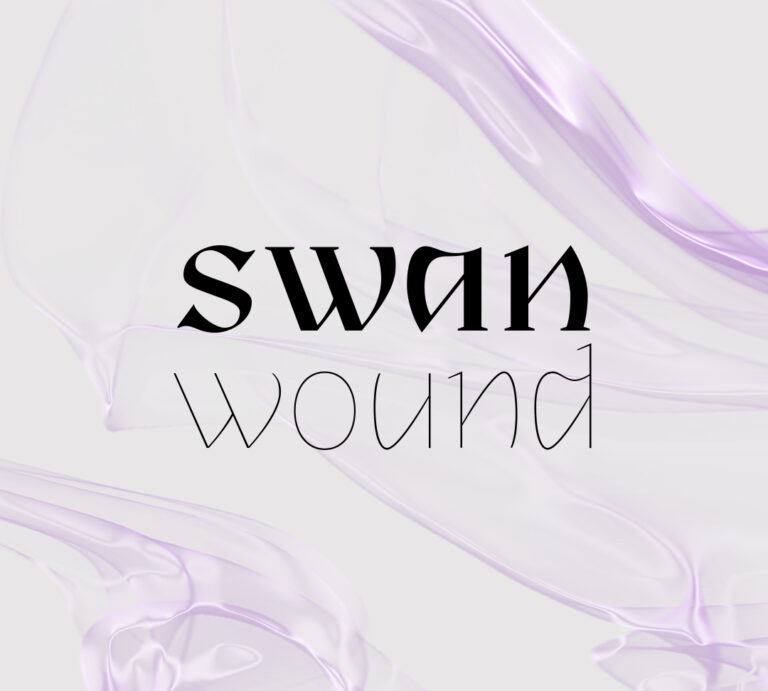
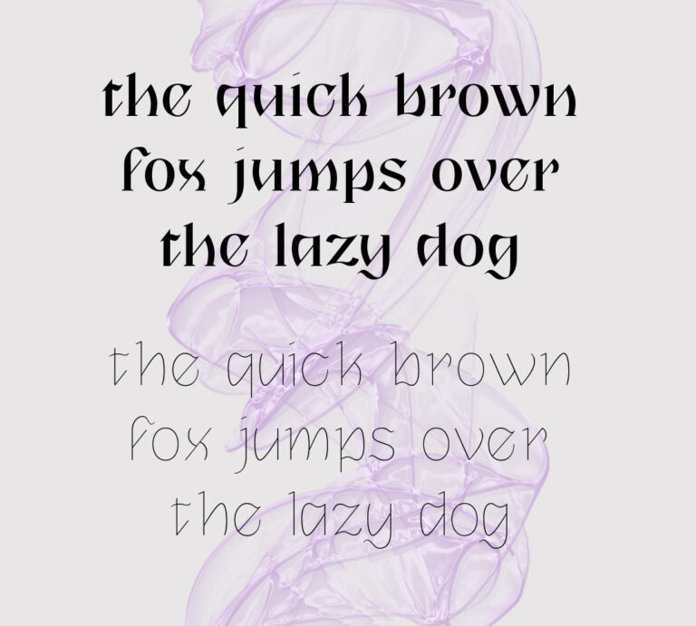
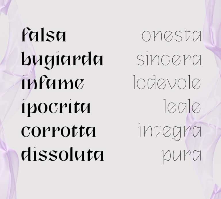
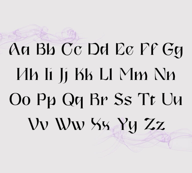
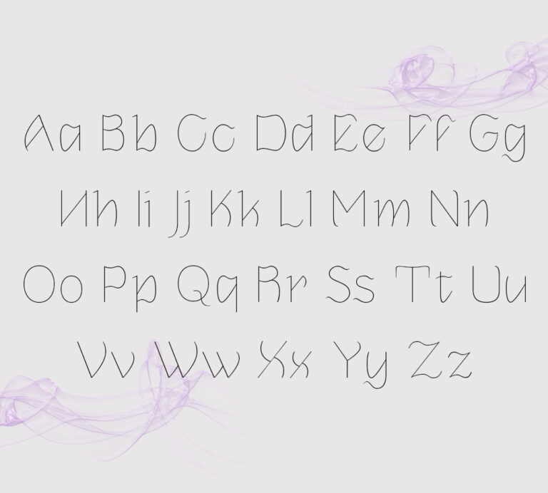
Swanwound
Swanwound is the typeface I developed during the Type Design course at cfp Bauer; it is a character composed of two weights that represent the dichotomy between good and evil: the two weights have the same structure but reflect two personalities. To purchase it, send an email to federica.aulenta@gmail.com (2021)
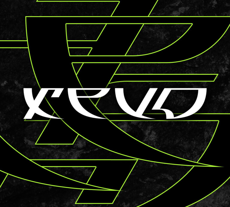
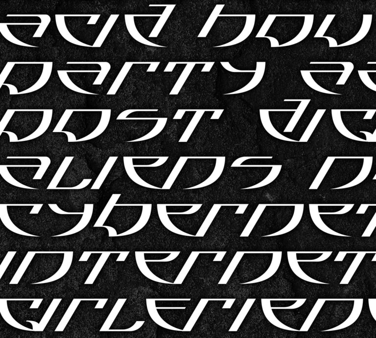
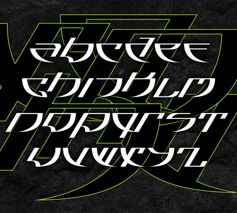
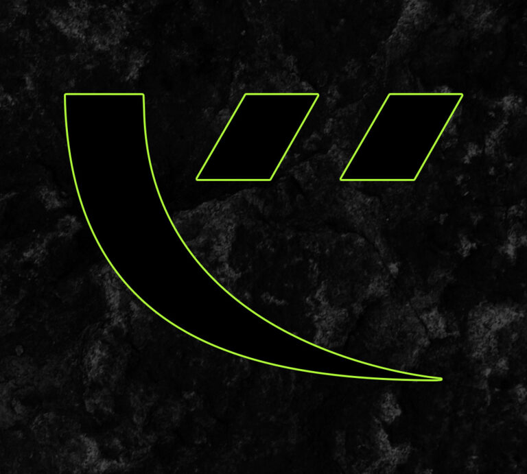
Xevo
Xevo is a typeface inspired by rave culture and acid house iconography. Its shapes derive from the sharp letters and illustrations found in some rave flyers. It’s a display typeface, it should be used in headlines. It features lowercase characters and basic punctuation. Download here (2019)
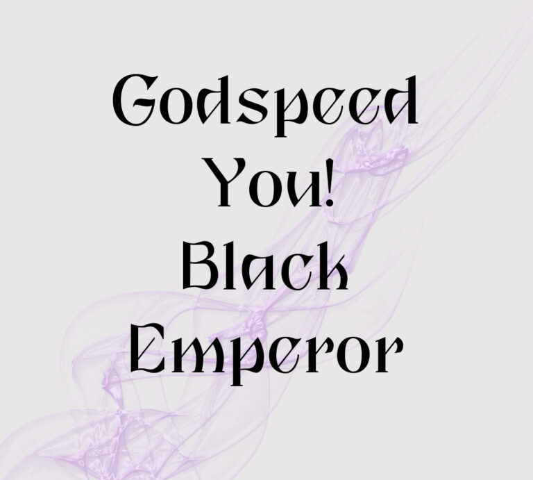
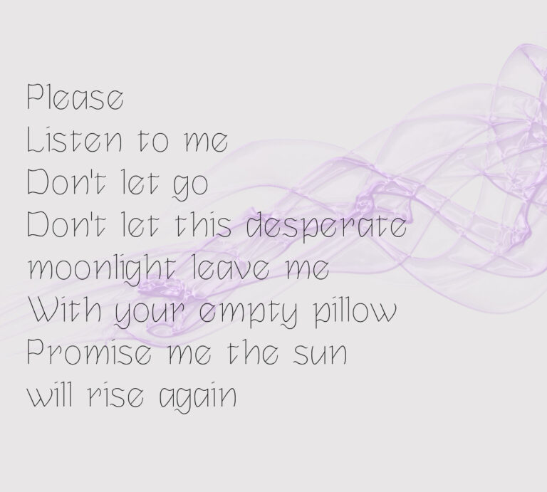
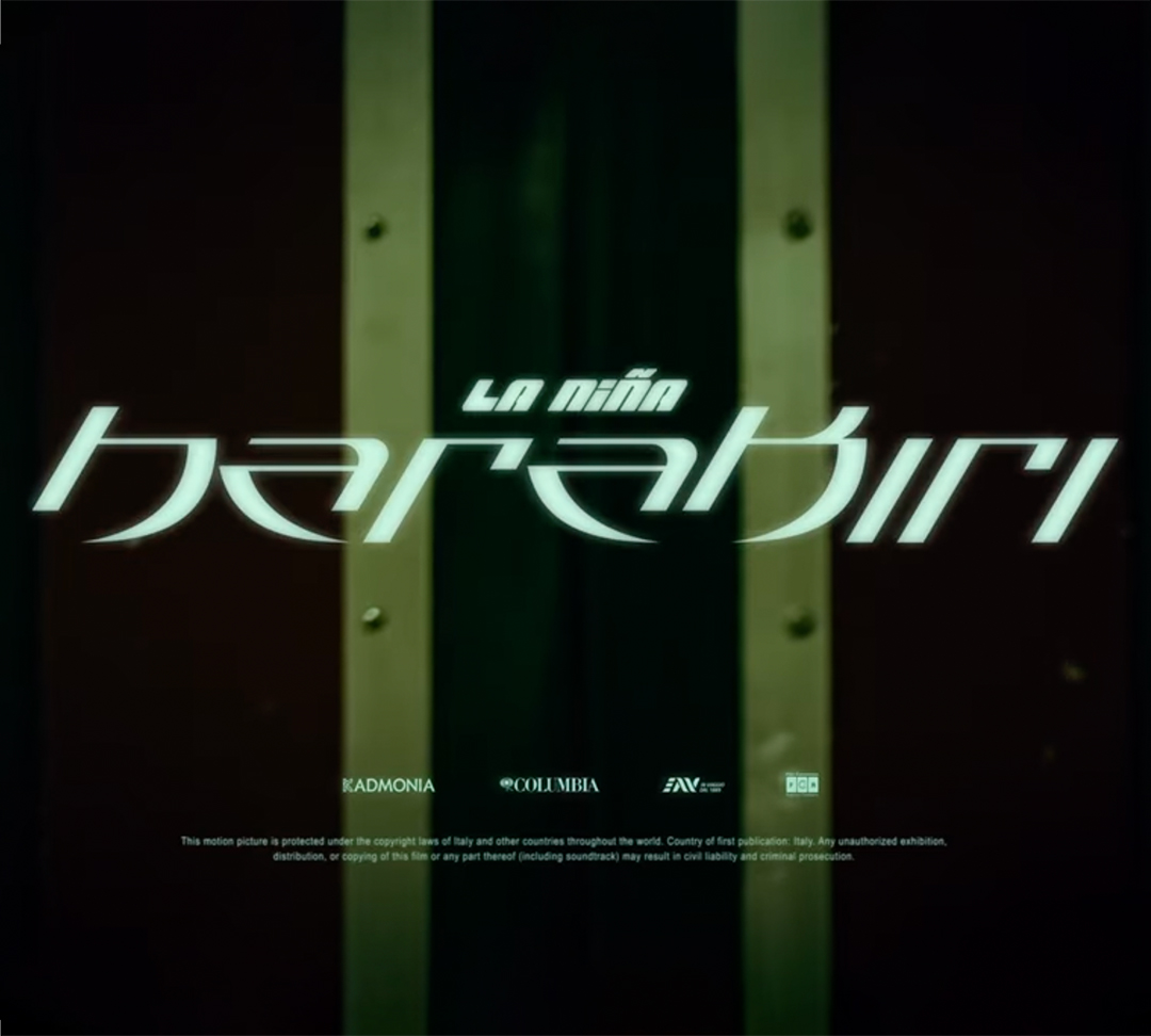
Fonts in use
A selection of works where fonts designed by me have been used by other designers.